This post was originally published on Medium in 2013.
I love New York City. It’s home, but it’s also a million cities in one. You can go from one neighborhood to another in a span of blocks, and sometimes that transition can be jarring.
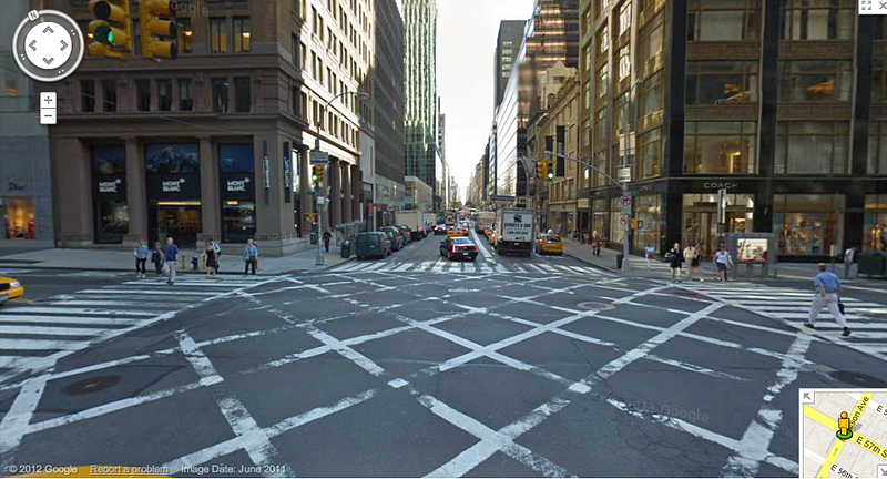
If you want a taste of those neighborhoods, just drive down Madison Avenue. Let’s start at 57th and Madison. Looking downtown, we get a glimpse of IBM’s offices.

Looking uptown, we see Mont Blanc and Coach stores across the street from each other. The next 40 blocks are similar: store after store selling luxury goods.
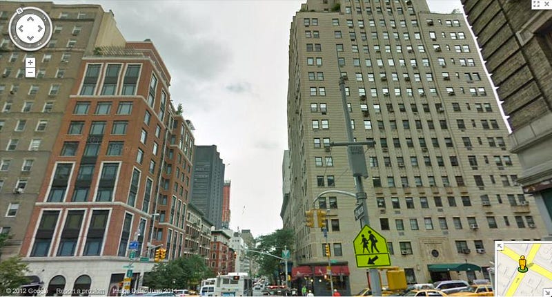
At 96th and Madison, the transition gradually begins. These large apartment buildings are the last ones you’ll see with penthouses for a while.
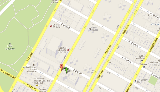
At 98th and Madison, you reach a 3 block stretch of Mount Sinai hospital complexes.
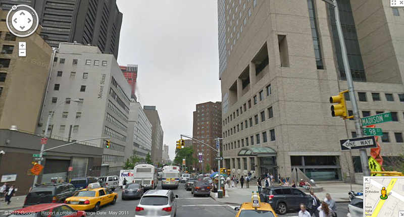
When I was a kid, there were only 2 buildings. Slowly but surely, the hospital has bought whole blocks of the surrounding area and built a complex of emergency rooms, teaching hospitals, and doctors' offices.
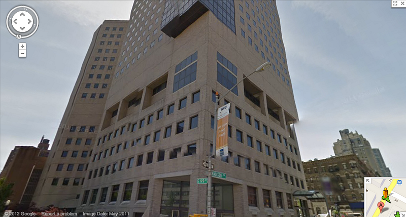
At 102nd and Madison, construction on a beautiful new building that houses classrooms for Mt. Sinai’s medical school just finished.
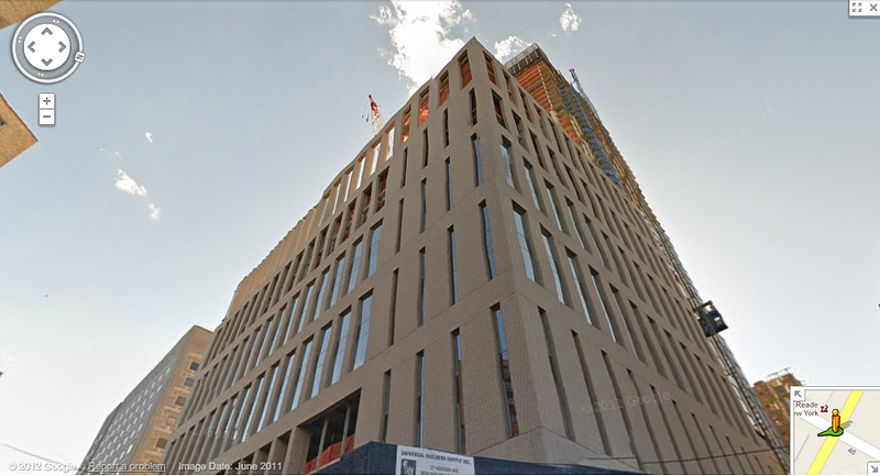
That new medical school sits across the street from the George Washington Carver houses, one of the first project complexes you’ll enter on the way into East Harlem.
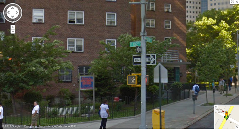
And at 103rd and Madison, you see a 1950s-era public school across the street from another low-income housing complex. It’s the school I attended for nearly 8 years in elementary school, but more on that later.
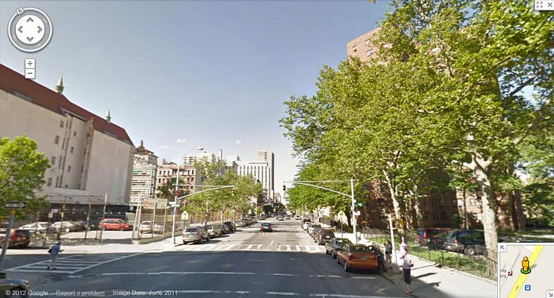
There’s no real 100th and Madison, since 100th Street never actually intersects Madison. But it acts as a sort of “Platform 9 3/4,” dividing two very different socioeconomic classes. It’s a divide that shouldn’t exist.
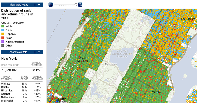
Let’s paint a more convincing picture. Here is a map of the city’s ethnic makeup based on the 2010 census, courtesy of the New York Times. Each dot represents 25 people. Green dots represent White New Yorkers, blue dots represent Black New Yorkers. Yellow dots represent Hispanics, red dots represent Asians, purple dots represent Native Americans, and grey dots represent “other”. See that line on the right side of the image where green ends and yellow begins? That’s 98th street.
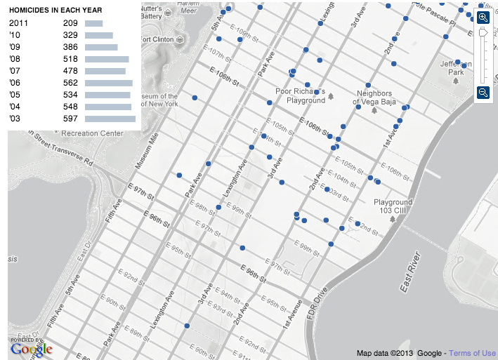
How about a map of homicides from 2003-2011, also courtesy of the New York Times:
Want a clearer picture? Here’s a map of median income distribution from the 2010 census, courtesy of WNYC.
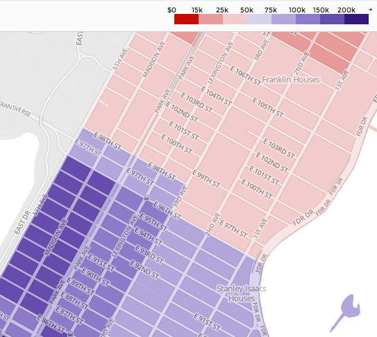
At 96th St., median income is $184,583 +/- $75,883.
At 98th St., median income is $82,750 +/- $40,958.
At mythical 100th St. and the immediate area uptown, median income is $28,196 +/- $6,021.
It’s a $150,000 decrease of income potential in 4 blocks.
The real issue is educational opportunity. Here is a graph of student performance, courtesy of the New York Times, at P.S. 77 Lower Lab, located at 96th Street and 3rd Avenue. P.S. 77 has 340 students total (K-8). 7% are “poor,” qualifying for the federal free lunch program. 92% of 3rd graders passed their state tests, 55% were advanced proficient, and only 5% were below standard.
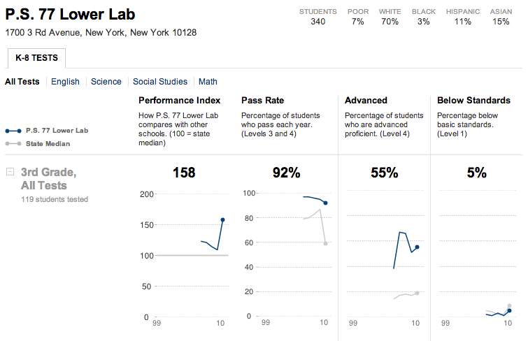
P.S. 171–the school I attended from pre-kindergarten to 6th grade–is located at 103rd and Madison. It has 615 students total (K-8), 100% of whom qualify for federal free lunch. Of third graders, 64% passed their state tests, 24% were advanced proficient, and 2% were below standard.
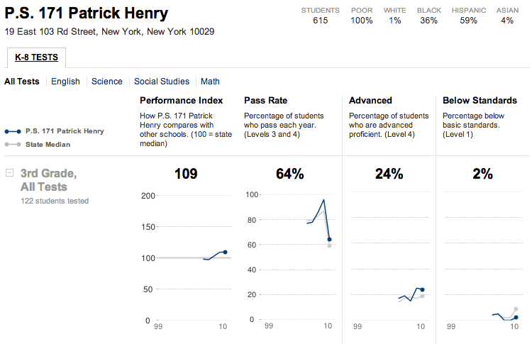
Now for P.S. 146, located at 106th Street and 1st Avenue. It has 450 students, 88% of whom qualify for federal free lunch. Yet only 20% of third graders passed their state tests, 2% were advanced proficient, and 35% were below standard.
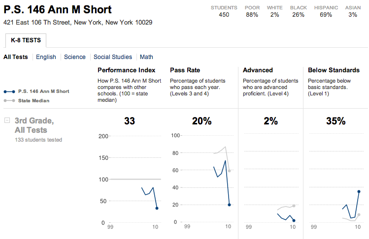
This is how cycles of poverty start. 3 schools, 3 very different educational outcomes.
A block can make a world of difference.
 zmh.org


