This post was originally published on Medium in 2014.
Ask any Mac power user about their menubar and you’ll get a different list of 5-10 must-have applications and utilities that boost productivity. The menubar is the mission control of a user’s computer, giving them an at-a-glance view of stats and apps that are important to them. The menubar can become so crowded, in fact, that’s there’s a menubar app that collects menubar apps. So meta.

History of the Menubar App
As far as I can tell, the first menubar app appeared in the 2002 release of Mac OS X 10.2, nicknamed Jaguar. Apple had just released iChat, and part of the iChat interface was the ability to change your availability status from the menubar. But as Mac Developer Ari Weinstein has pointed out in a note, “NSStatusItem, the API developers use to create menu items, has existed since OS X 10.0 (or longer, it probably originated as part of Rhapsody in the late ’90s).”
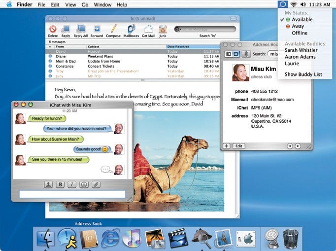

By 2005 and the release of OS X 10.4 Tiger, other apps began to use the menubar interface to expose app status, preferences, and frequently-used features.
The menubar is a uniquely restrictive interface. Animations on the menubar icon can be distracting, but can also be a useful status indicator. Windows aren’t persistent, so you can’t count on the user keeping the window open as they multitask.
In short, menubar apps face unique design constraints. Let’s take a look at 15 apps with a menubar presence— Caffeine, Layervault, Skitch, F.lux, Cloudup, Crashplan, 1Password, Day One, Dropbox, Twitter, Cloudapp, Evernote, Droplr, Fantastical, and Mint.
Window dimensions
The sizes and aspect ratios of 15 top menubar apps range pretty significantly:
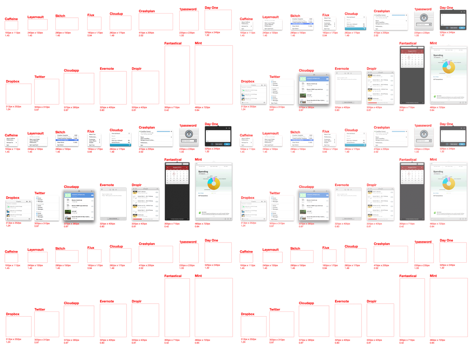
Width vs. Height (in Pixels) of the Apps Listed Above
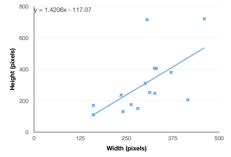
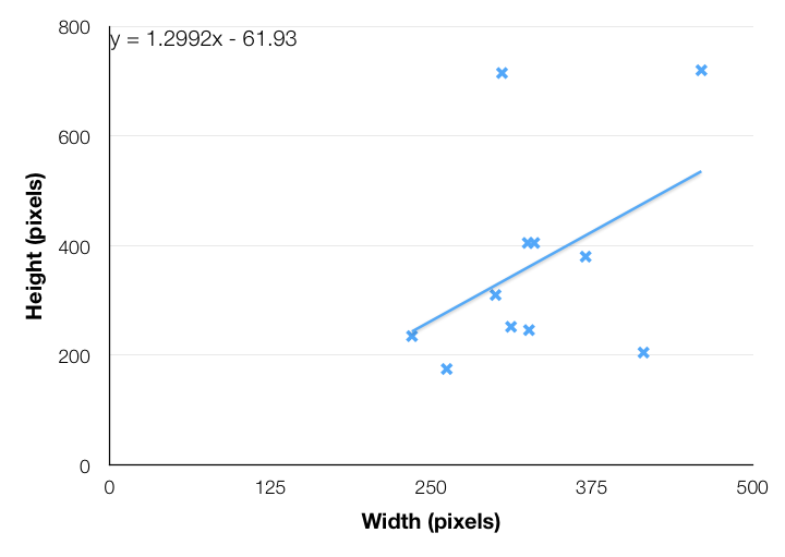
This isn’t an entirely fair comparison, however, since not all the apps are stateful. Some (like Caffeine) are glorified context menus, while others (like Mint) display changing information and allow users to interact with the app. If we remove Caffeine, Skitch, Layervault, and F.lux, we get a good estimate of the ratio of width:height for full-blown menubar apps.
Width vs. Height (in Pixels) of Stateful Menubar Apps
Resource Usage
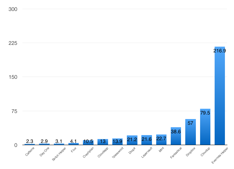
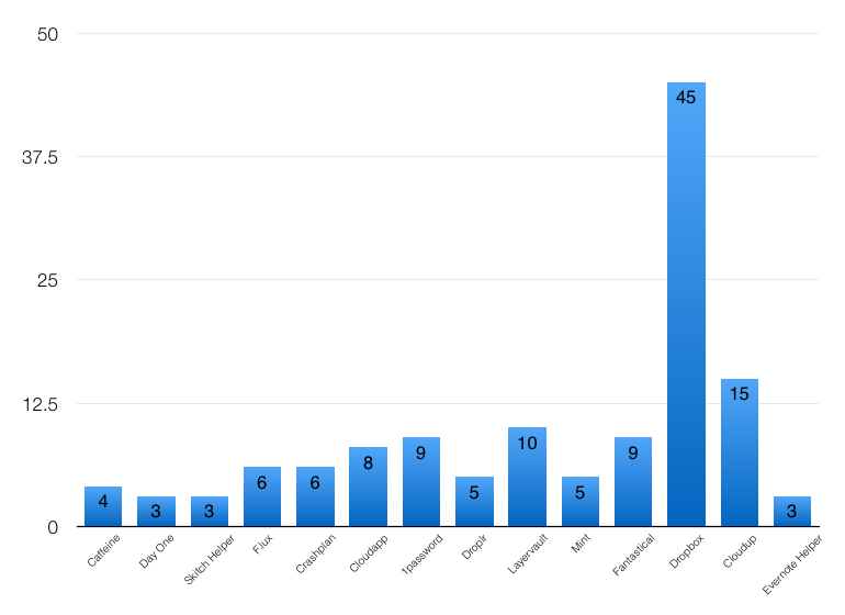
A few things about my process here — these metrics were taken on a Late 2013 Retina Macbook Pro running OS X 10.9.4 with Activity Monitor 10 minutes after a fresh restart (to deal with any usage spikes immediately after a restart). None of the apps were doing active work (e.g. Dropbox wasn’t syncing any files). I only took metrics for the “helper” process if the menubar app was an interface for a larger app (e.g. Evernote and Skitch have separate app and menubar processes). And I excluded Twitter because it doesn’t have a separate menubar process and it didn’t seem fair to include the entire app’s usage in the comparison. Obviously some of these stats will depend on your system, hardware, OS, etc.
RAM Usage (in megabytes)
Processor threads used
Most Common Colors Used in Icons

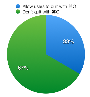
Quit with ⌘Q?
Only 5 of the 15 apps (Cloudup, Cloudapp, Droplr, Fantastical, Mint) listed allow users to quit the app by pressing ⌘+Q while the menubar app is enabled.
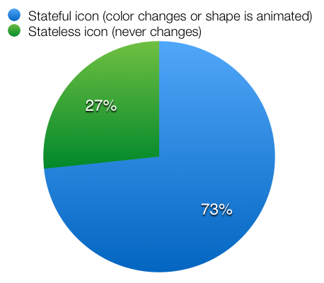
Icon interactivity
Most of the menubar apps have an icon that animates or changes color (i.e. the Dropbox icon when files are syncing). Only 4 don’t— 1Password, F.lux, Skitch, and Evernote.
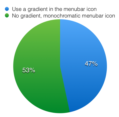
Gradient in menubar icon
There’s no consensus on whether menubar icons should be monochromatic (all black) or use a gradient.
Thanks for reading!
Like this post? You should also check out Bowery.io, an easy way to set up your development environment, visit my website, or [follow me on Twitter at @zmh](http://twitter.com/zmh).
 zmh.org


