Citymapper is what happens when you actually understand user experience.
This post was originally published on Medium in 2014.
Every so often, an app comes along that just completely understands the way you think. I don’t normally write long posts about an app I’ve used. But Citymapper is so incredibly well-made that I decided to put together a list of common use cases of a maps app, and how both Google Maps and Citymapper handle them.
Scenario 1: I need to get somewhere as fast as possible.
Citymapper, 10 seconds: I can see all 4 options (public transport, walking, car/taxi, and biking) side-by-side, allowing me to compare options quickly.
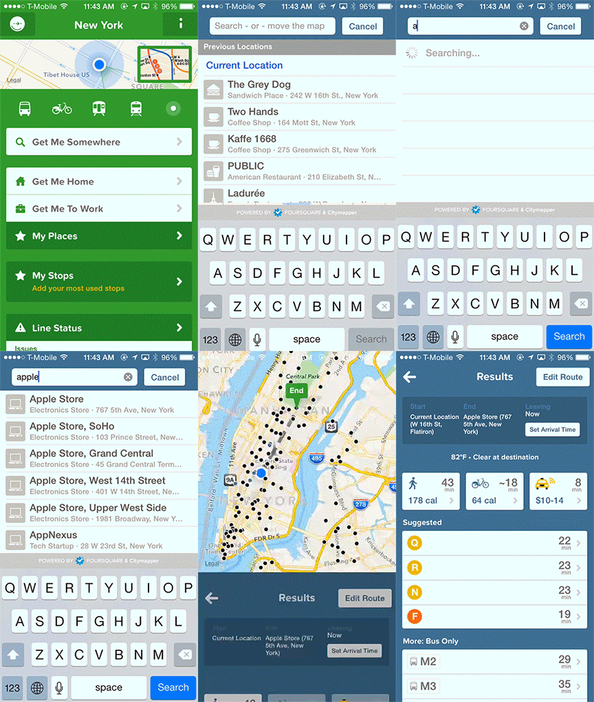
Google Maps, 20 seconds: I need to click through each individual option and remember which is the fastest. Also, the flyover animation is cool but unnecessary when I’m trying to see what the fastest time is.
Scenario 2: I want to see the time needed to get from point A to point B.
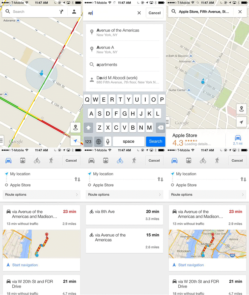
Citymapper, 10 seconds: I can enter my origin and destination at the same time.
Google Maps, 30 seconds: I need to first enter my destination, then specify how I want to get there, and then change my origin from “My Location” to a different address.
Scenario 3: What are the trains near me?
Citymapper, 2 seconds: Since I know the subway system pretty well, I don’t always need full directions — I just need to know where the closest subways are so I can judge which one I should take. With one click on the train icon, I can see all the trains near me, sorted by distance. Same thing for buses.
Google Maps, 30+ seconds: There’s no way to see all nearby trains, so you have to manually look around your waypoint and click on each station. There is a public transit option in the sidenav, but it only highlights the lines on the map and you still need to click through to see which stations are closest. And at transit hubs (in this case, Union Square) it considers different subway entrances and lines as separate, so it won’t let you see aggregate information for a particular station.
Scenario 4: How long will it take me to get somewhere by Citibike?
Google Maps, can’t do it: Google Maps doesn’t have bikeshare integration, so I’m forced to switch apps and use the equally scatterbrained Citibike app to find availability.
Citymapper, 15 seconds: Not only does Citymapper find where the nearest Citibike location is and let me choose whether I want the fastest route or the quietest (read: safest) route, it also notices that the closest Citibike location to my destination has no available spaces and reroutes me to the next closest one that does. That’s magical.
Scenario 5: I just searched for directions at the office, and now I want to see those directions again.
Citymapper, 5 seconds: Previously searched destinations can be found right underneath the search bar for easy access.
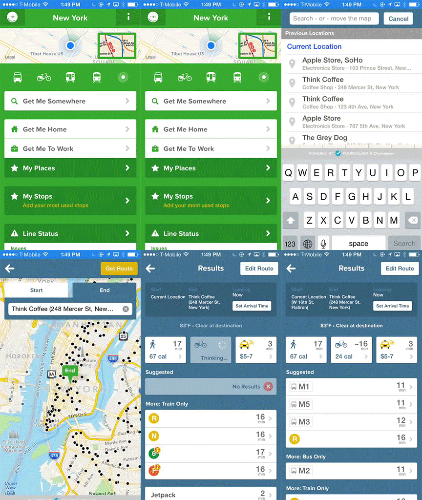
Google Maps, 10 seconds — if you know where to find it: For some reason, previously searched destinations are found under your profile (the person icon next to the search bar) instead of when I search. I never noticed that until I started writing this post.

Scenario 6: I’m late to a meeting so I’m sprinting as quickly as possible down the street, looking at my phone for directions.
In any other app, shaking my phone might mean “undo last action” (e.g. Mailbox) or “submit feedback” (e.g. some beta builds of mobile apps). In a maps app, though, there’s pretty much one thing a shaking phone means — I’m running, biking, or just moving. And when I do any of that with Google Maps, this happens:
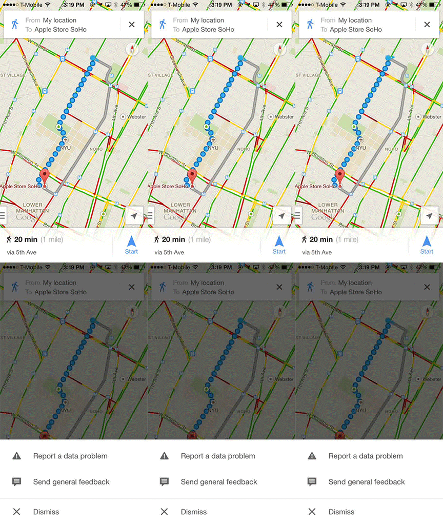
It blocks my view, it shuts off turn-by-turn directions, and is altogether a pretty terrible interaction.
Other design details
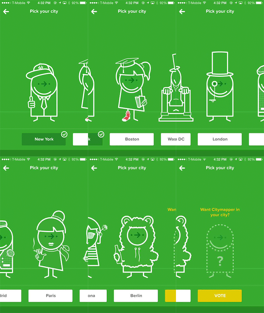
City icons
Going to a different city? Citymapper’s customized icons for each of its supported metro areas gives the app personality.
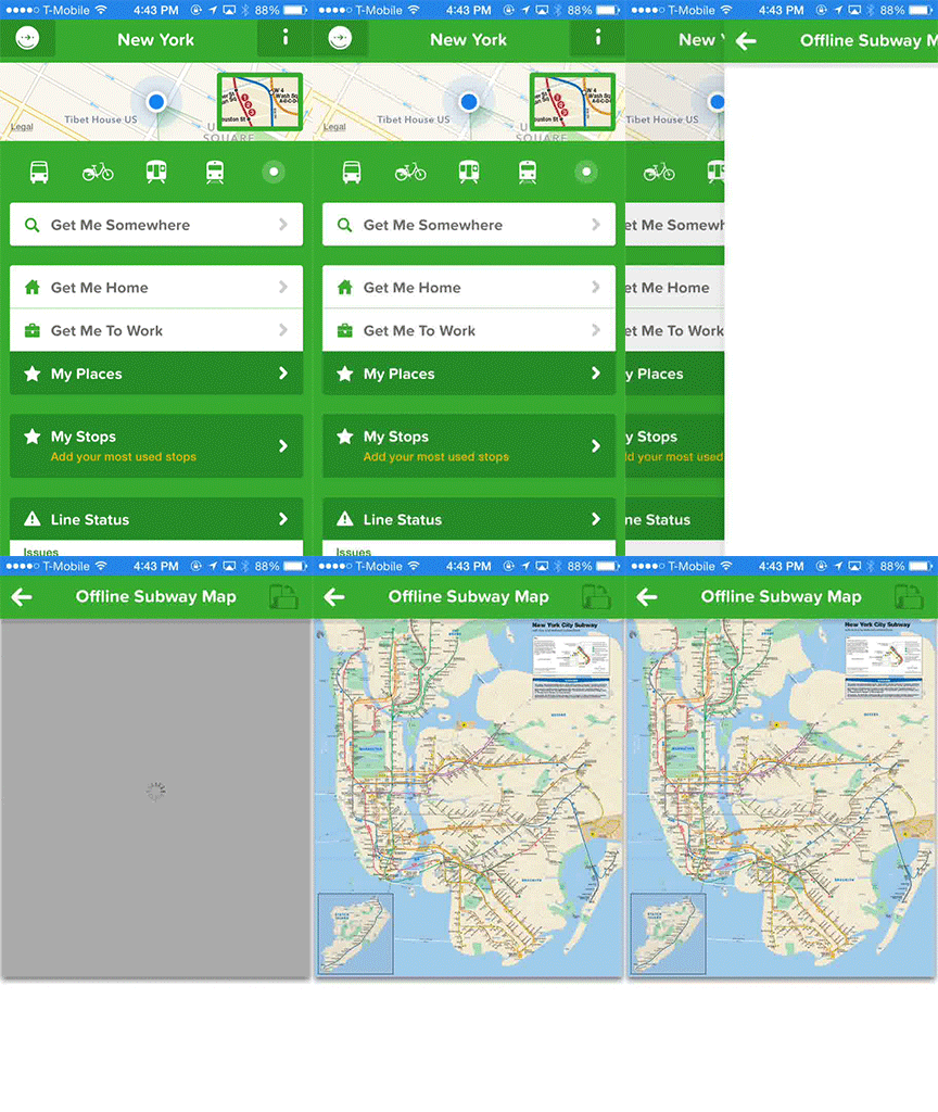
Offline subway map
If you’re in the subway, you can access a full offline zoomable subway map by clicking on an icon on the homescreen. They also have a “Save trips” option on the directions screen so you can save directions for offline use (e.g. on a subway).
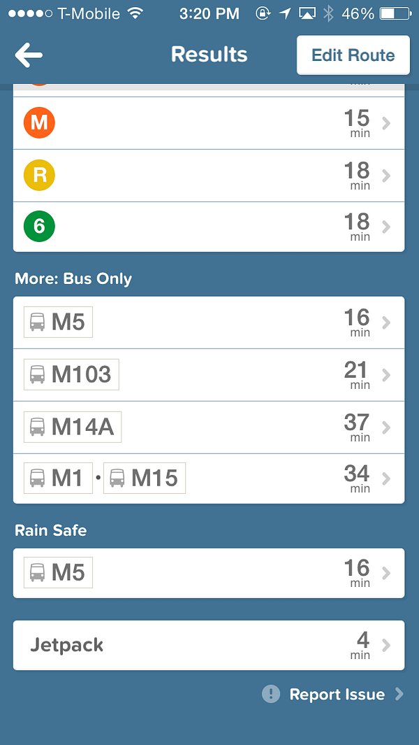
Humor
First, their release notes are legitimately funny (see Twitter examples).
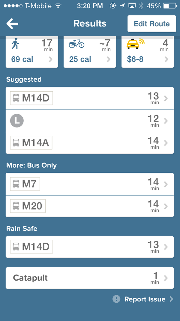
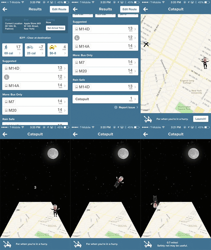
And when presenting your transit options, Citymapper will occasionally throw in a funny option:
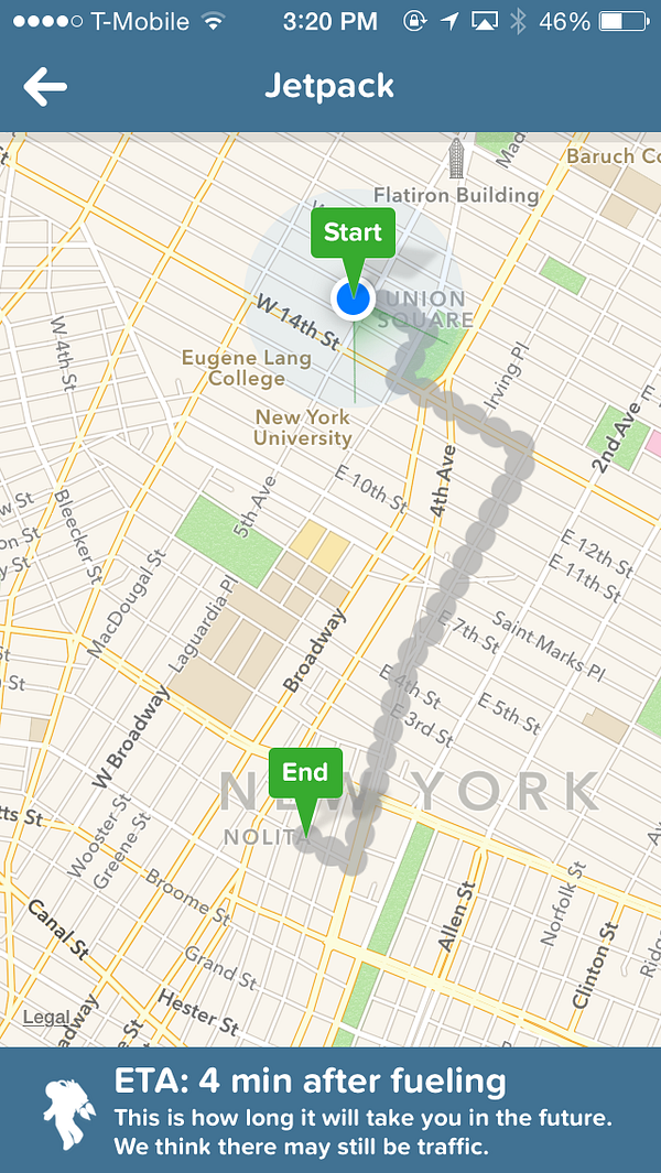
or sometimes:
But I guess I’m easily amused.
Final thoughts
Citymapper is more thoughtfully designed for urban travel. But for people who drive cars, something like Waze — with its fullscreen interface and crowdsourced realtime information — is a better choice.
And there are still features I would love to have in Citymapper. Turn-by-turn directions. Spoken directions for when I’m on a Citibike. Maybe personalized time estimates that are tailored to my walking, running, and biking speeds. But whatever Citymapper adds to the app in the coming months, I know it will be thoughtfully engineered and designed to make finding directions almost fun.
If you’re so inclined, you can download Citymapper here. (And disclaimer: I have no relation to Citymapper. Just a happy user. They didn’t even know I was writing this post.)
 zmh.org


