This post was originally published on Medium in 2015.
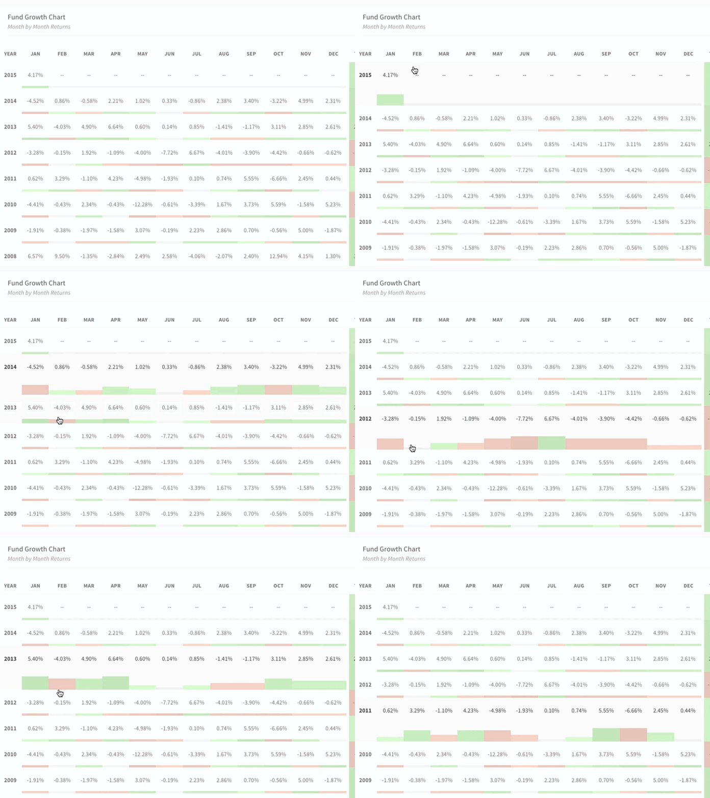
Space-saving combination of a bar chart and color-coded table. Source
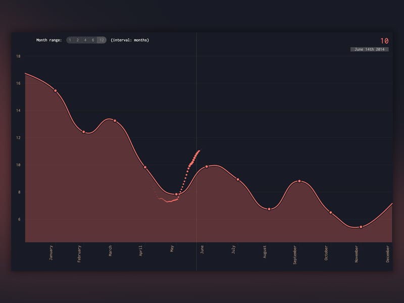
Combines averaged data with a preview of the full data set as you move your cursor around. Source
Storytelling + financial data in a relatively easy to understand format due to intelligent shading, color choice, and animation. Source
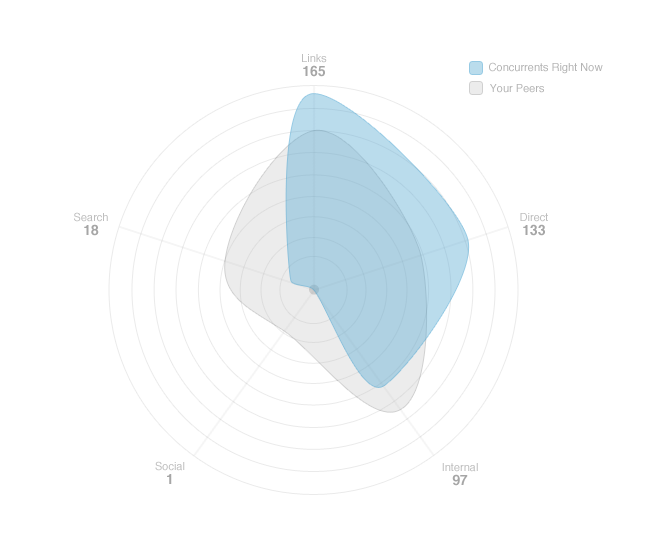
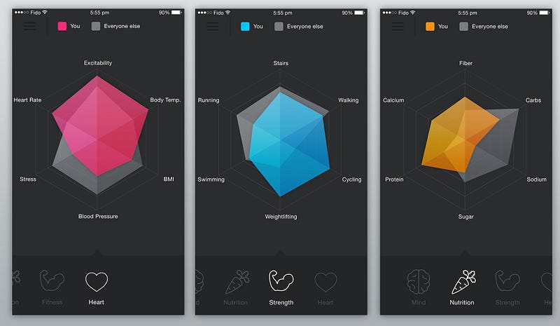
Radar chart that presents data on five axes, using transparency to make comparison easy. Source
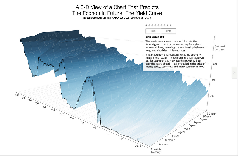
Attractive line charts that stay bearable in 3D because of overlaid elevation markers. Source
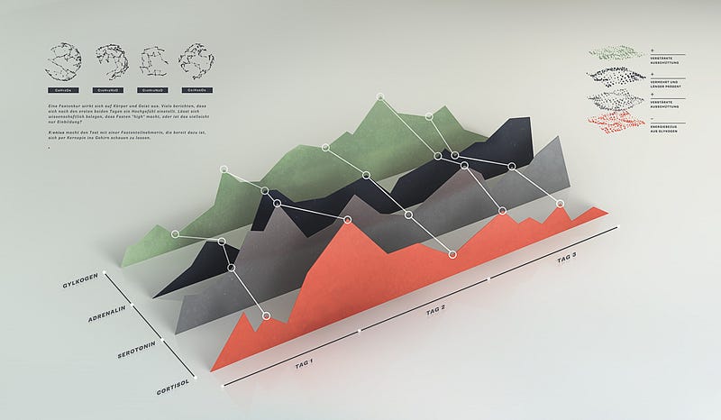
Great color choice and chart annotations. Source
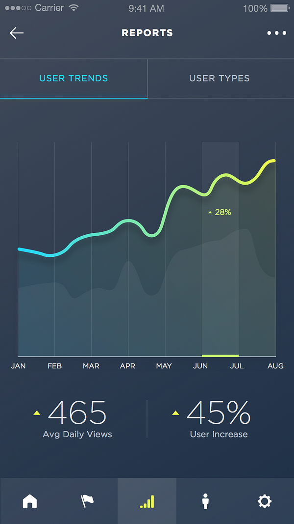
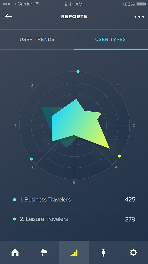
Great use of color and shapes, though hard to read at times. Source
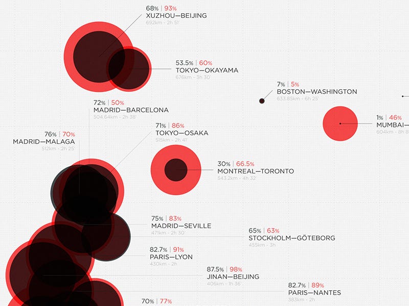
Radar charts again used to quickly present comparisons. Source
Great use of animation to show cyclical data. Source

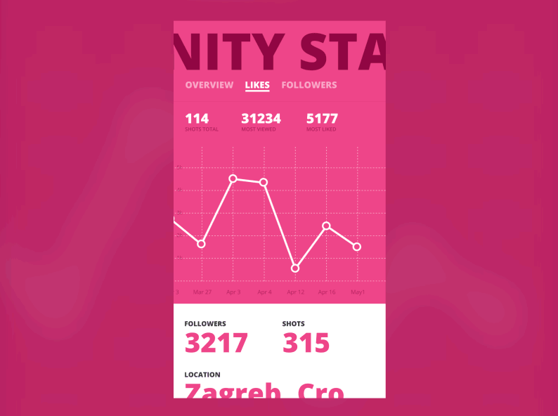
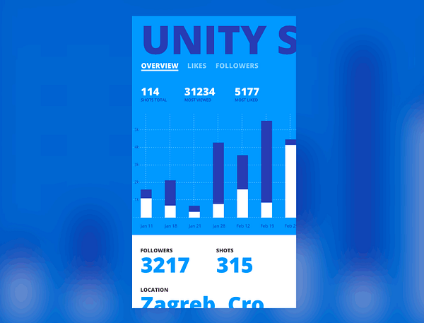
Seamless transitions between different chart types. Source
 zmh.org


